

HARE 2012.05.11
location: DAIMYO FUKUOKA
category: SHOP
year: 2012
credits:
PRODUCTOIN / ZYCC CORPORATION
LIGHTNING DESIGN / DAIKO ELECTRIC Co.,Ltd.
PHOTOGRAPH / KOZO TAKAYAMA
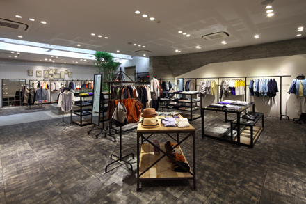
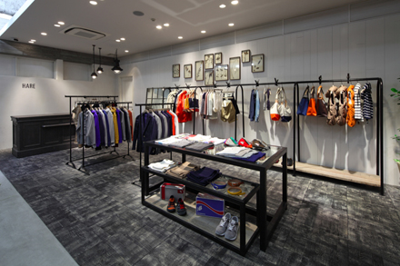
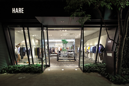
時代のブームを表現する" とし "生活の一部であること" をコンセプトに商品
を提案するブランド『HARE』のメンズレディス複合店。
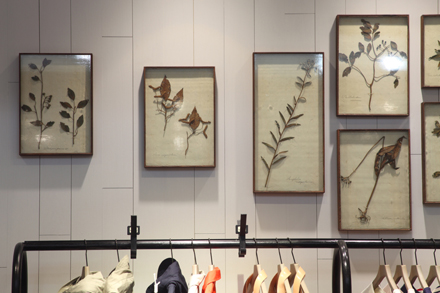
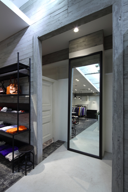
内装デザインに求められたのは装飾を最大限まで削ぎ落した建築的シンプ
ルさと、その中にもさりげない主張やこだわりを感じられる空間に仕上げる
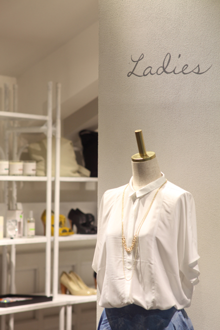
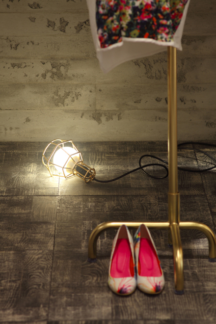
こと。白、黒、グレーのモノトーンな色合いで統一されたメンズの空間に対
し、レディスの空間には淡い色合いの木材とシャンパンゴールドを加えた白
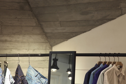
を基調とした内装にまとめでメンズと差別化。また斜めに走る梁や壁面など
で空間が単調にならないよう抑揚をつけている。
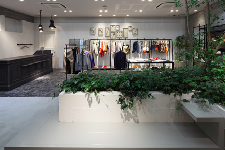
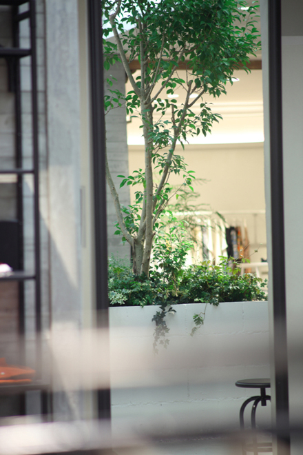
中央には外光が差し込む中庭を模した空間を設け、広い店内の中で軽く腰
掛けて寛げるスペースを用意。カップルでのんびり商品を見れるように考慮
し、ひとりひとりの滞在時間が長い居心地の良いお店を目指してデザインさ
れている。
“HARE” is a brand for both sexes, offering “basic line” and “own style” with
the concept of “To be the part of life”. For opening the store, the brand’s
director proposed for simplicity by cutting off decorations as much as poss-
ible, but on the other hand, remaining casually the principle and peculiar
taste of the brand in its interior. Compared to the simple men’s area, which
is integrated with monotone based color such as black, white and gray,
women’s area is differentiated by using softly-colored wooden materials
and champagne gold in white based interior. There is also an area like a
patio with sun shine in the center of the store, where people can sit and chat
easily. This is part of the design aiming to provide a comfortable space for
customers, especially for couples, to spend a long time in the store looking
for items.
